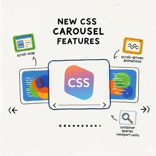
CSS Carousels Without JavaScript: A Guide
Pure CSS Carousel with Snap and Native Dots (No JS!)
Ready to make your website pop—without a single line of JavaScript? Let’s build a carousel that’s not just functional, but fun, fast, and future-proof. Here’s how you can impress your users (and yourself) with pure HTML and CSS magic:
🎢 Step 1: Snap Into Action
Imagine a carousel that glides smoothly and always lands perfectly on each slide. That’s what CSS Scroll Snap does! Just add these styles:
I will use list elements for the carousel for accessibility better support.
.carousel {
  /* Clean list styles */
  list-style: none;
  padding: 0;

  display: flex;
  overflow-x: auto;
  scroll-snap-type: x mandatory;
  scroll-behavior: smooth;
  scroll-padding: 1rem;
  gap: 1rem;
}
.slide {
  list-style: none;

  flex: 0 0 100%;
  scroll-snap-align: start;
  width: 100%;
  height: 400px;
}

.slide--red {
  background: red;
}
.slide--green {
  background: green;
}
.slide--yellow {
  background: yellow;
}
 <ul class="carousel">
    <li class="slide slide--red">Slide 1</div>
    <li class="slide slide--green">Slide 2</div>
    <li class="slide slide--yellow">Slide 3</div>
</ul>
Give it a try—swipe or scroll, and watch each slide snap satisfyingly into place. No more awkward half-visible slides!
bonus track: if we use the
scroll-snap-stop: always;prop it will blow your mind! because it will stop on every slide on swipe
What does scroll-snap-stop: always; do?
By default, if you swipe quickly, the browser might skip over some slides and only snap to the one closest to where you let go. But with scroll-snap-stop: always;, the browser is told: “Stop at every snap point, no matter how fast the user swipes!”
This means every slide gets its moment in the spotlight—no skipping! It’s perfect for carousels where you want users to see each item, one by one, even if they try to flick through quickly. Just add it to your slide CSS:
.slide {
  scroll-snap-stop: always;
}
Now, every swipe will land on a slide, making your carousel feel even more controlled and delightful.
Until now if we hide the scrollbar with
scrollbar-width: none;we already have a cool no js carousel but we want more
👀 Step 2: Let the Browser Track the Show (All CSS!) !warning from now it will render in modern chrome browsers better
Want to know which slide is in the spotlight? You don’t need any special HTML attributes—just pure CSS! The magic happens with the new scroll-marker and scroll-marker-group CSS properties and pseudo-elements.
Here’s how you do it:
.carousel {
  scroll-marker-group: after;
}
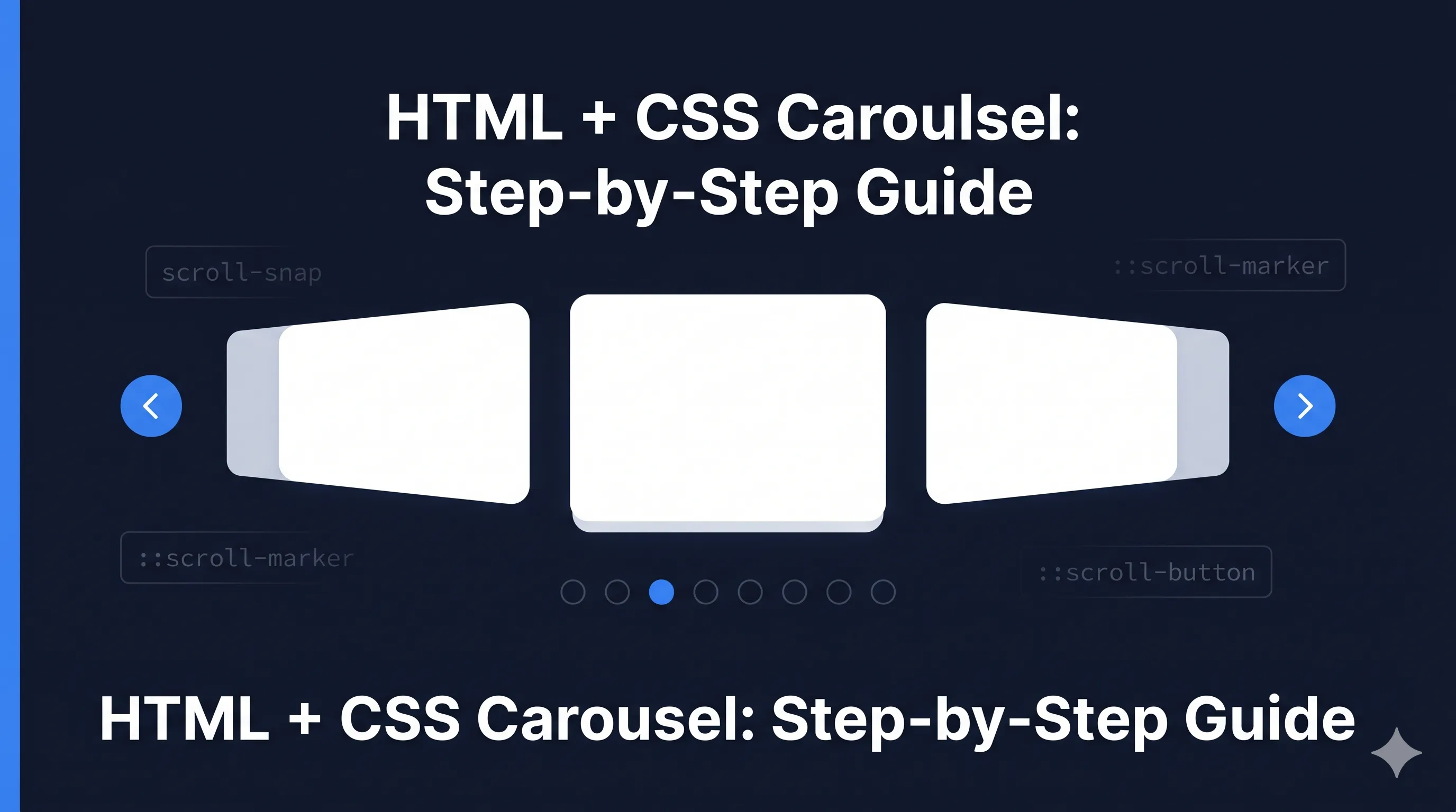
.carousel::scroll-marker-group {
  display: flex;
  gap: 10px;
  justify-content: center;
  margin-top: 1rem;
}
.slide::scroll-marker {
  content: "";
  width: 16px;
  height: 16px;
  background: #ccc;
  border-radius: 20px;
  transition: background 0.3s, width 0.3s;
}
.slide::scroll-marker:target-current {
  background: #0070f3;
  width: 32px;
}
That’s it! No extra markup, no attributes—just CSS. As you scroll, the browser automatically tracks which slide is active and updates the indicator dots below your carousel.
Why is this so cool?
- 🚫 No JavaScript—just HTML and CSS
- ⚡ Blazing fast and accessible for everyone
- 🪄 Native indicators, zero extra markup
- 🤩 Modern, magical, and super easy to maintain
Give it a spin and watch your carousel come alive—all with the power of modern CSS. Your users (and your future self) will thank you!
🎯 Place Your Dots Anywhere: Anchor Positioning Unleashed
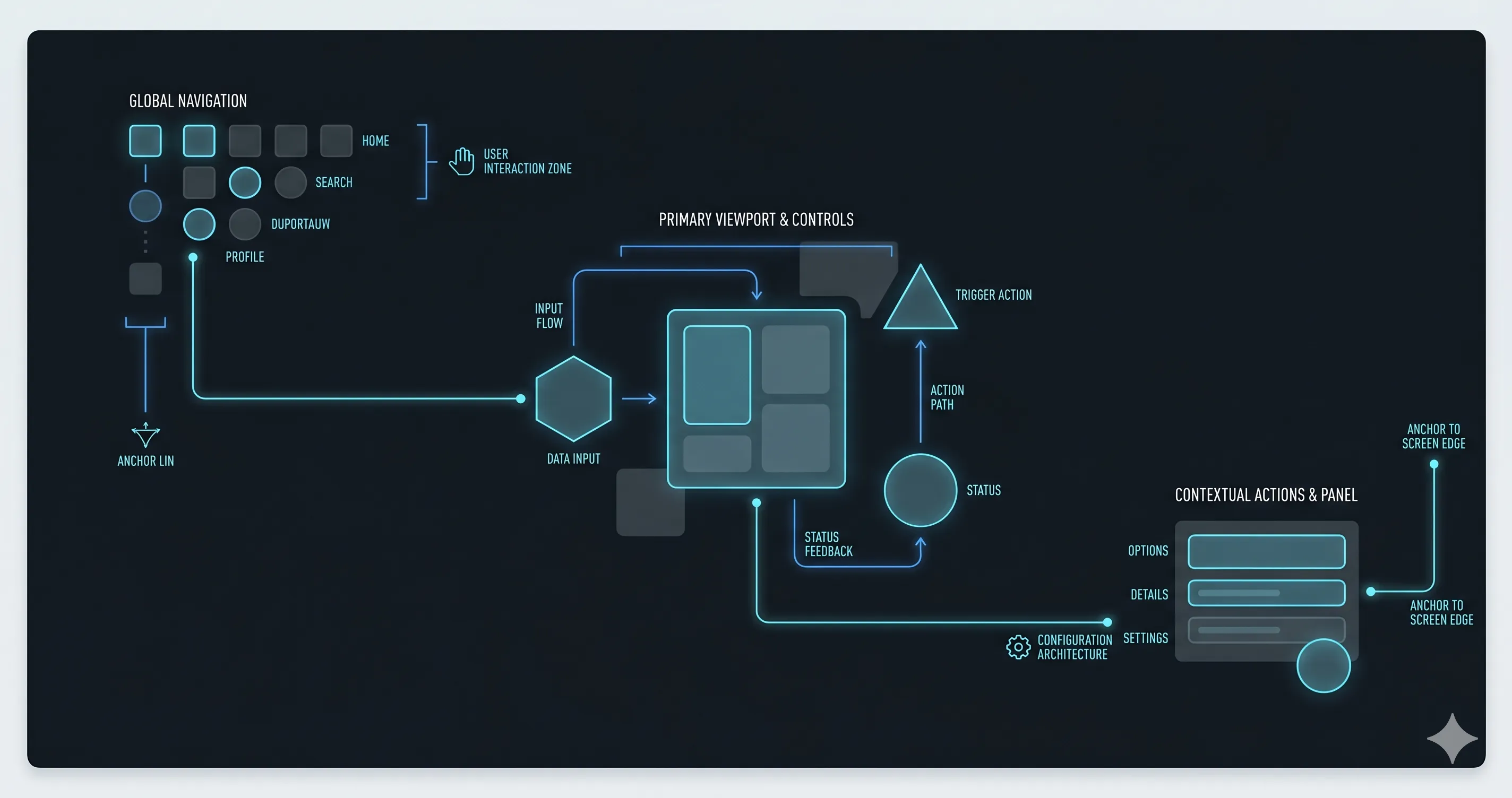
Why settle for default dot placement? With CSS anchor positioning, you’re in control—put your indicator dots above, below, beside, or floating anywhere around your carousel. It’s all about creative freedom and pixel-perfect layouts!
Here’s how you can make your marker group pop exactly where you want it:
.carousel {
  anchor-name: --carousel;
}
.carousel::scroll-marker-group {
  /* Place the dots at the bottom center, or get creative! */
  position-anchor: --carousel;
  position: fixed;
  position-visibility: anchors-visible;
  position-area: bottom center;
}
Want your dots on the side? Floating in a corner? Just tweak the CSS! Anchor positioning lets you adapt the layout to match your wildest design ideas. (See more examples and docs)
Pro tip: Combine this with flex-direction to make your marker group vertical or horizontal—whatever fits your vibe.
Lets make some space for arrows
.carousel {
    margin-inline: 50px;
    padding-inline: 10px;
}
Now define global css for arrow buttons
.carousel::scroll-button(*) {
    position: fixed;
    position-anchor: --carousel;
}
And add the arrow button left and right or
.carousel::scroll-button(right) {
    position-area: inline-end center;
    content: "→" / "Next";
}
.carousel::scroll-button(left) {
    position-area: inline-start center;
    content: "←" / "Prev";
}
Note the content definition with the content / accesibility name then we can use materialicon font or some similar to draw it I am using simple arrow emojis but you can replace it with any icon font you prefer.
🚀 Ready to See It in Action?
Curious how all these pieces come together? Check out this live, interactive example and play with the code yourself:
Pure CSS Carousel with scroll-marker (CodeSandbox)
Give it a try, remix it, and see how far you can push modern CSS—no JavaScript required!
Happy coding!

Comments for 0JSCRS