
CSS Anchor Positioning: The Future of UI Placement
The Problem with JavaScript Positioning
For years, positioning tooltips, popovers, and dropdown menus required JavaScript libraries like Popper.js or Floating UI. You’d calculate positions, handle viewport collisions, manage scroll events, and fight z-index wars.
CSS Anchor Positioning eliminates all of that. You declare which element to anchor to, and where to place the positioned element - that’s it.
The Core Concept
Anchor Positioning works in two steps:
- Name an anchor - Give any element an
anchor-name - Position relative to it - Use
position-anchorandposition-areaon the positioned element
/* Step 1: Name the anchor */
.trigger-button {
  anchor-name: --my-button;
}

/* Step 2: Position relative to it */
.tooltip {
  position: fixed;
  position-anchor: --my-button;
  position-area: top center;
}
That’s the entire concept. No JavaScript coordinates, no resize observers, no manual calculations.
Real Example: Floating Summary Modal
Here’s how I position the AI summarizer modal on this site:
.summary-bubble {
  position: fixed;
  bottom: 2rem;
  right: 2rem;
  width: 64px;
  height: 64px;
  anchor-name: --summary-bot;
}

.summary-modal {
  position: fixed;
  position-anchor: --summary-bot;
  position-area: top left;
  max-width: 400px;
  width: 90vw;
}
The modal automatically positions itself above and to the left of the button. When the button moves (different screen sizes, scroll position), the modal follows.
Understanding position-area
The position-area property uses a 9-region grid model:
┌─────────┬────────┬──────────┐
│ top     │ top    │ top      │
│ left    │ center │ right    │
├─────────┼────────┼──────────┤
│ center  │ center │ center   │
│ left    │        │ right    │
├─────────┼────────┼──────────┤
│ bottom  │ bottom │ bottom   │
│ left    │ center │ right    │
└─────────┴────────┴──────────┘
Common values:
top center- Above the anchor, centeredbottom left- Below the anchor, aligned leftspan-top span-left- Span across top-left quadrant
Real Example: Share Button Notification
Here’s a notification positioned relative to a share button:
#share {
  anchor-name: --share-button;
}

#notification {
  position: fixed;
  position-anchor: --share-button;
  bottom: calc(anchor(top) + 10px);
  /* Position 10px above the anchor's top edge */
}
The anchor() function gives you precise control - reference any edge of the anchor and add offsets.
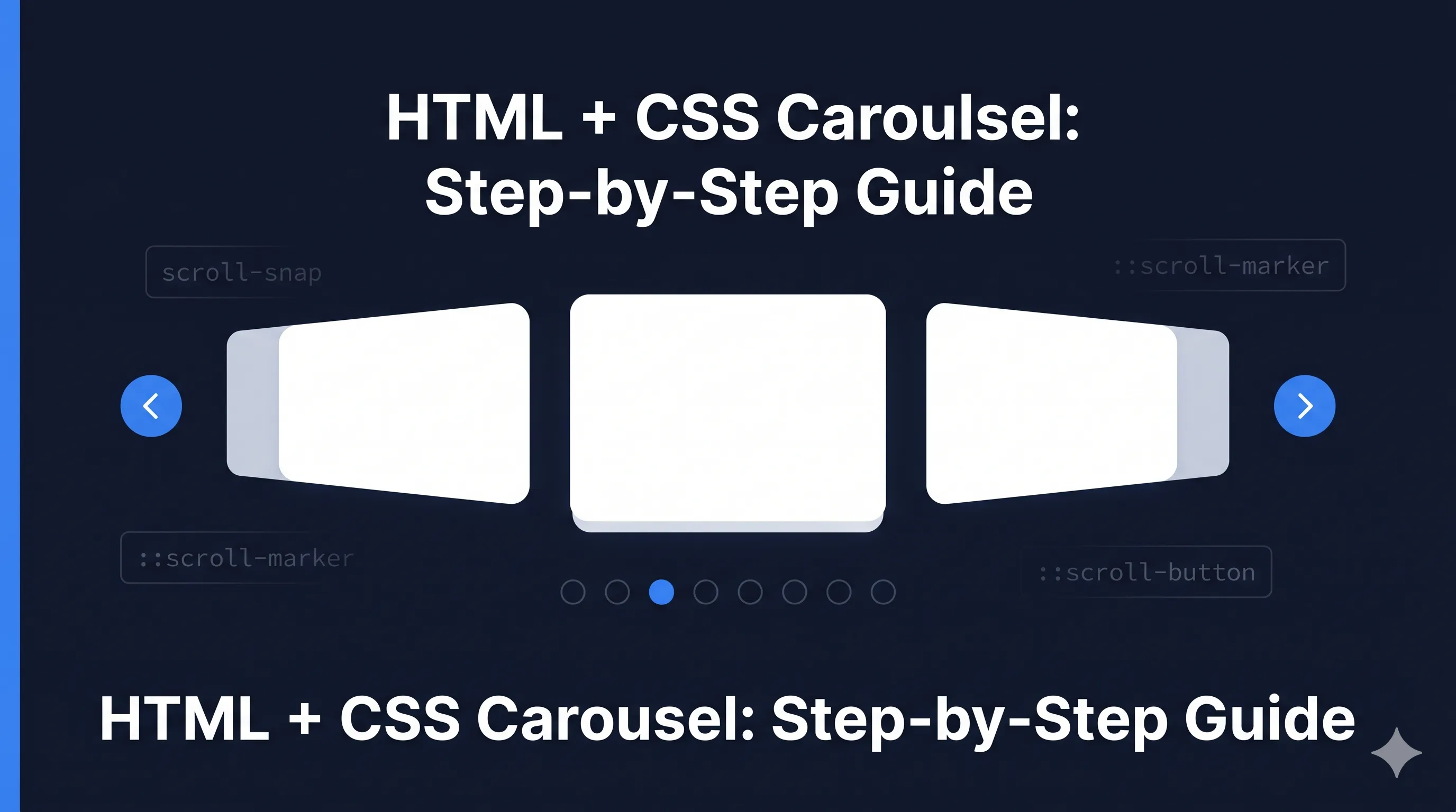
Real Example: Carousel Navigation
For scroll marker navigation in carousels:
ul.carousel {
  anchor-name: --badges-carousel;
  /* ... scroll snap styles */
}

ul.carousel::scroll-marker-group {
  position: fixed;
  position-anchor: --badges-carousel;
  position-area: block-end;
  /* Positioned below the carousel */
}
Dynamic Anchor Names
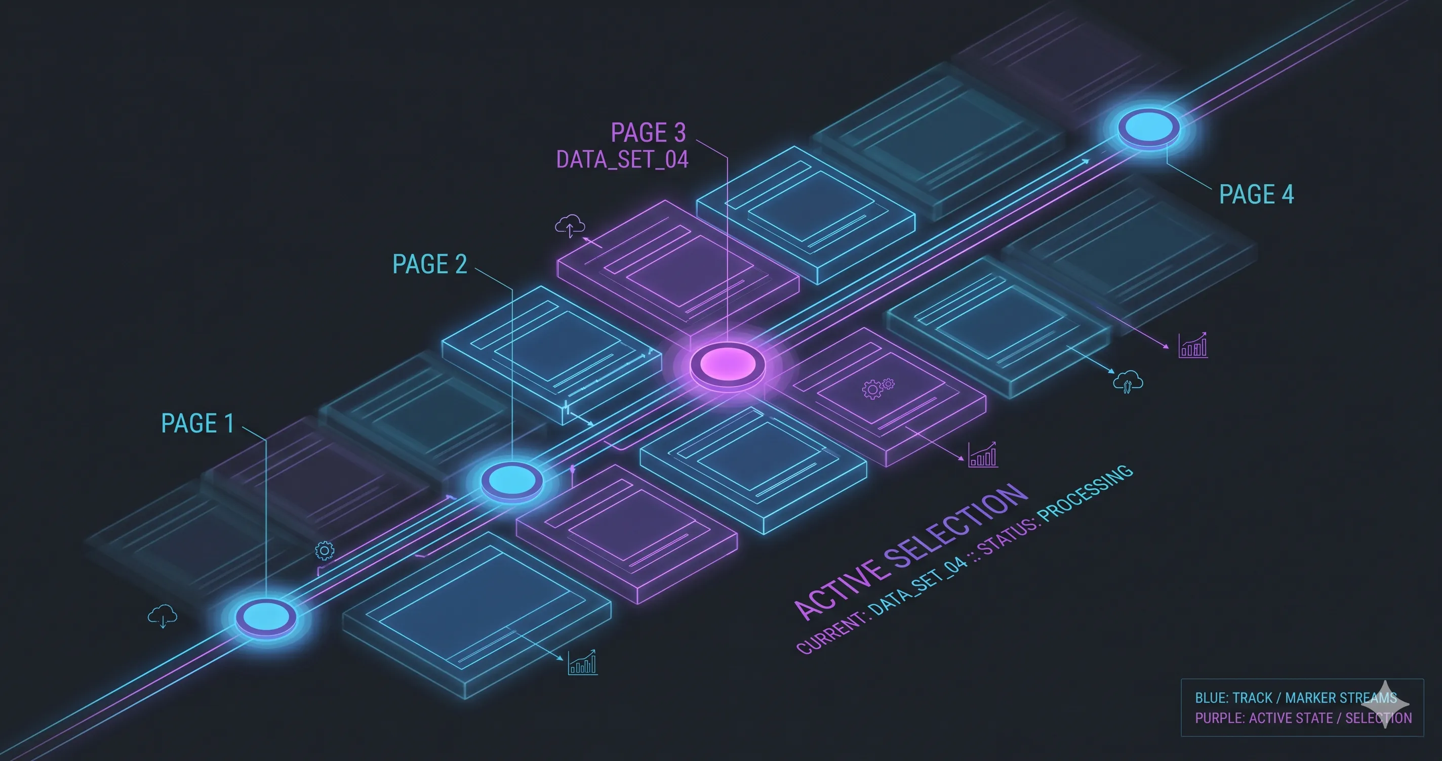
For lists where each item needs its own anchor, use CSS custom properties:
---
const items = ['Item 1', 'Item 2', 'Item 3']
---

{items.map((item, i) => (
  <div style={`anchor-name: --item-${i}`}>
    {item}
  </div>
))}
Or in pure CSS with attribute selectors:
[data-anchor="tooltip-1"] {
  anchor-name: --tooltip-1;
}

[data-anchor="tooltip-2"] {
  anchor-name: --tooltip-2;
}
Viewport Collision Handling
The browser automatically handles viewport collisions with position-try:
.tooltip {
  position: fixed;
  position-anchor: --button;
  position-area: top center;

  /* Fallback positions if top doesn't fit */
  position-try: flip-block, flip-inline, flip-block flip-inline;
}
Values:
flip-block- Flip vertically (top ↔ bottom)flip-inline- Flip horizontally (left ↔ right)
The anchor() Function
For precise positioning, use the anchor() function:
.positioned {
  position: fixed;
  position-anchor: --button;

  /* Position at anchor's bottom edge + 8px */
  top: calc(anchor(bottom) + 8px);

  /* Center horizontally with the anchor */
  left: anchor(center);
  translate: -50% 0;
}
The function accepts:
anchor(top),anchor(bottom),anchor(left),anchor(right)anchor(center)- Center of the anchoranchor(start),anchor(end)- Logical properties
Browser Support (2026)
As of early 2026:
- Chrome 125+: Full support
- Edge 125+: Full support
- Firefox: Behind flag, expected soon
- Safari: Under development
For production, check support and provide fallbacks:
.tooltip {
  /* Fallback: fixed position */
  position: fixed;
  top: 50%;
  left: 50%;
  transform: translate(-50%, -50%);
}

@supports (anchor-name: --test) {
  .tooltip {
    position-anchor: --button;
    position-area: top center;
    transform: none;
  }
}
Key Takeaways
- No JavaScript required - Pure CSS for positioning logic
- Automatic updates - Positioned elements follow their anchors
- Viewport aware - Built-in collision detection with
position-try - Precise control -
anchor()function for pixel-perfect placement - Progressive enhancement - Works with fallbacks for unsupported browsers
CSS Anchor Positioning is one of the most impactful CSS features in recent years. It eliminates entire categories of JavaScript code and makes UI positioning declarative and predictable.
See it in action: The floating robot button in the bottom right corner of this page uses anchor positioning for its modal. Try clicking it!

Comments for cssnch