
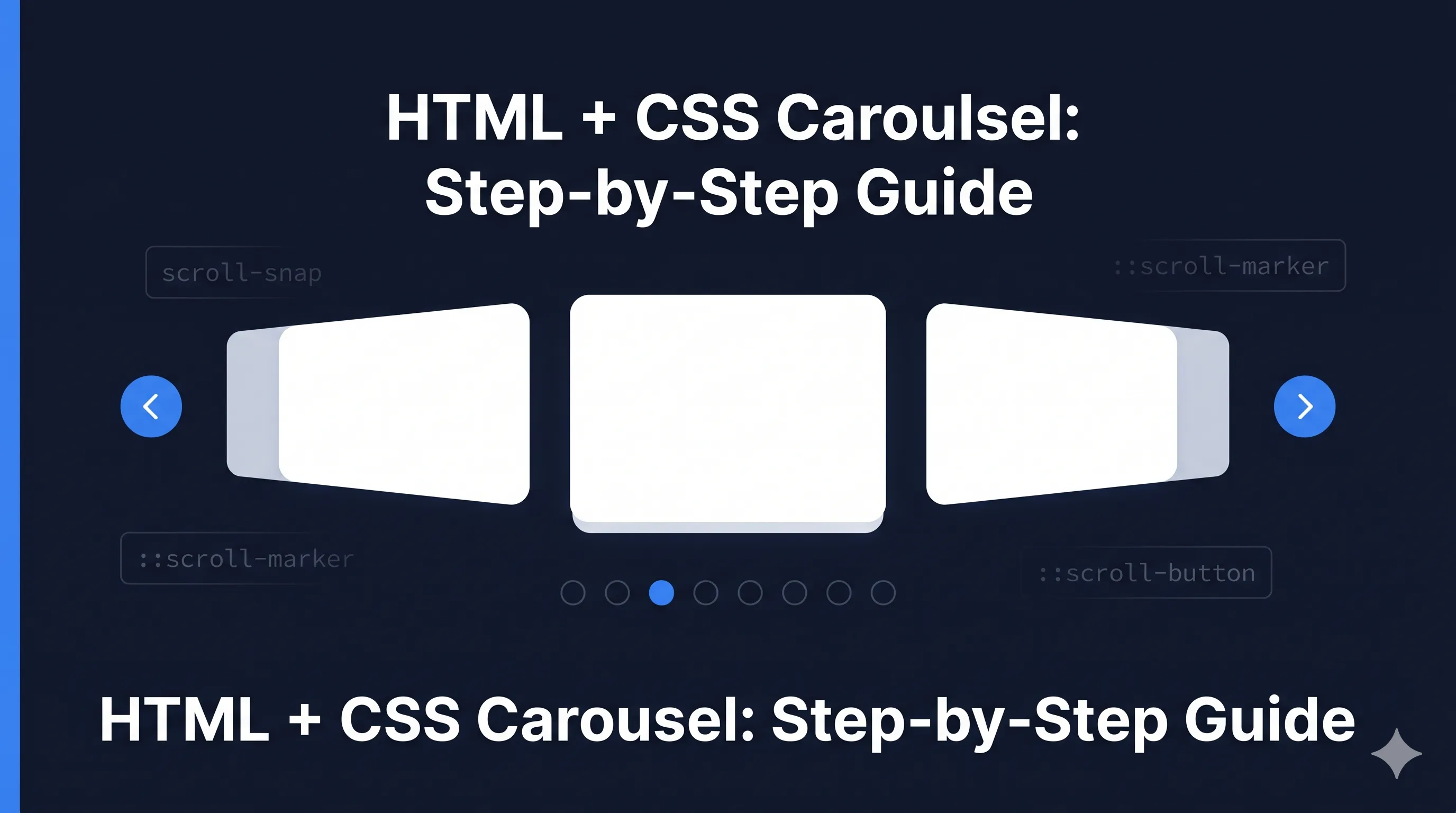
CSS Carousels 2026: Native Scroll Markers Finally Here
CSS Carousels: Finally No JavaScript Required
For years, carousels meant JavaScript libraries, complex accessibility considerations, and bundle size debates. In 2026, CSS can handle it natively with ::scroll-marker and ::scroll-button pseudo-elements.
Browser Support (2026)
| Browser | Support | Notes |
|---|---|---|
| Chrome 135+ | Full | Since March 2025 |
| Edge 135+ | Full | Chromium-based |
| Firefox | Partial | Flag-enabled |
| Safari 18.2+ | Full | Since Dec 2025 |
Global support: ~75% (Growing rapidly)
Consider progressive enhancement - scroll snap works everywhere, markers add enhanced UX.
The Foundation: Scroll Snap
Before markers, you need scroll snapping:
.carousel {
  display: flex;
  overflow-x: auto;
  scroll-snap-type: x mandatory;
  gap: 1rem;
}

.carousel-item {
  flex: 0 0 100%;
  scroll-snap-align: center;
}
This gives you a basic swipeable carousel. Now let’s add native navigation.
Scroll Markers: Pagination Dots
The ::scroll-marker pseudo-element creates pagination indicators:
.carousel {
  scroll-marker-group: after; /* Show markers after carousel */
}

.carousel-item::scroll-marker {
  content: '';
  width: 12px;
  height: 12px;
  border-radius: 50%;
  background: rgba(0, 0, 0, 0.3);
}

.carousel-item::scroll-marker:target-current {
  background: #3b82f6;
  transform: scale(1.2);
}
:target-current styles the marker for the currently visible item.
Scroll Buttons: Previous/Next Navigation
Native scroll buttons for arrow navigation:
.carousel::scroll-button(prev) {
  content: '←';
  position: absolute;
  left: 0;
  /* Styles for previous button */
}

.carousel::scroll-button(next) {
  content: '→';
  position: absolute;
  right: 0;
  /* Styles for next button */
}

/* Hide when can't scroll further */
.carousel::scroll-button(prev):disabled,
.carousel::scroll-button(next):disabled {
  opacity: 0.3;
  pointer-events: none;
}
Complete Carousel Example
.carousel-wrapper {
  position: relative;
}

.carousel {
  display: flex;
  overflow-x: auto;
  scroll-snap-type: x mandatory;
  scroll-behavior: smooth;
  gap: 1rem;
  padding: 1rem;

  /* Enable scroll markers */
  scroll-marker-group: after;

  /* Hide scrollbar */
  scrollbar-width: none;
  &::-webkit-scrollbar { display: none; }
}

.carousel-item {
  flex: 0 0 calc(100% - 2rem);
  scroll-snap-align: center;
  border-radius: 8px;
  background: #f1f5f9;
  padding: 2rem;
}

/* Pagination dots */
.carousel-item::scroll-marker {
  content: '';
  display: inline-block;
  width: 10px;
  height: 10px;
  margin: 0 4px;
  border-radius: 50%;
  background: #cbd5e1;
  cursor: pointer;
  transition: all 0.2s ease;
}

.carousel-item::scroll-marker:target-current {
  background: #3b82f6;
  transform: scale(1.3);
}

.carousel-item::scroll-marker:hover:not(:target-current) {
  background: #94a3b8;
}

/* Navigation buttons */
.carousel::scroll-button(prev),
.carousel::scroll-button(next) {
  position: absolute;
  top: 50%;
  transform: translateY(-50%);
  width: 40px;
  height: 40px;
  border-radius: 50%;
  background: white;
  box-shadow: 0 2px 8px rgba(0,0,0,0.15);
  display: flex;
  align-items: center;
  justify-content: center;
  cursor: pointer;
  transition: opacity 0.2s;
}

.carousel::scroll-button(prev) {
  content: '‹';
  left: 8px;
}

.carousel::scroll-button(next) {
  content: '›';
  right: 8px;
}

.carousel::scroll-button(prev):disabled,
.carousel::scroll-button(next):disabled {
  opacity: 0;
  pointer-events: none;
}
Multi-Item Carousel
Show multiple items at once:
.multi-carousel {
  display: flex;
  overflow-x: auto;
  scroll-snap-type: x mandatory;
  scroll-marker-group: after;
}

.multi-carousel-item {
  flex: 0 0 calc(33.333% - 1rem); /* 3 items visible */
  scroll-snap-align: start;
}

@media (max-width: 768px) {
  .multi-carousel-item {
    flex: 0 0 calc(50% - 0.5rem); /* 2 items on tablet */
  }
}

@media (max-width: 480px) {
  .multi-carousel-item {
    flex: 0 0 100%; /* 1 item on mobile */
  }
}
Vertical Carousel
Works on Y-axis too:
.vertical-carousel {
  display: flex;
  flex-direction: column;
  height: 400px;
  overflow-y: auto;
  scroll-snap-type: y mandatory;
  scroll-marker-group: inline-end; /* Markers on the right */
}

.vertical-carousel-item {
  flex: 0 0 100%;
  scroll-snap-align: start;
}

.vertical-carousel-item::scroll-marker {
  content: '';
  display: block;
  width: 10px;
  height: 10px;
  margin: 4px 0;
  border-radius: 50%;
  background: #cbd5e1;
}
Progressive Enhancement
For browsers without scroll marker support:
/* Base experience - always works */
.carousel {
  display: flex;
  overflow-x: auto;
  scroll-snap-type: x mandatory;
}

/* Enhanced experience when supported */
@supports (scroll-marker-group: after) {
  .carousel {
    scroll-marker-group: after;
  }

  .carousel-item::scroll-marker {
    content: '';
    /* ... marker styles */
  }

  /* Hide JS fallback dots */
  .js-pagination {
    display: none;
  }
}
Accessibility Considerations
CSS carousels get accessibility improvements for free:
- Keyboard navigation - Arrow keys scroll between items
- Focus management - Markers are focusable by default
- Screen readers - Native semantics for navigation
Enhance with ARIA where needed:
<div class="carousel" role="region" aria-label="Featured products">
  <div class="carousel-item" role="group" aria-roledescription="slide">
    <!-- Content -->
  </div>
</div>
Comparison: Before vs After
Before (JavaScript)
<div class="carousel" data-carousel>
  <div class="carousel-track">...</div>
  <div class="carousel-dots"></div>
  <button class="prev">←</button>
  <button class="next">→</button>
</div>
<script src="carousel.js"></script> <!-- 15-50KB -->
After (CSS-only)
<div class="carousel">
  <div class="carousel-item">...</div>
  <div class="carousel-item">...</div>
</div>
<!-- Zero JavaScript -->
Key Takeaways
- Native pagination -
::scroll-markercreates dots without JavaScript - Native navigation -
::scroll-button(prev/next)for arrow buttons - Smart state -
:target-currentand:disabledhandle active states - Progressive - Scroll snap works everywhere, markers enhance
- Accessible - Built-in keyboard and screen reader support
CSS carousels in 2026 eliminate the need for Swiper, Slick, and similar libraries for most use cases. The browser handles what used to require hundreds of lines of JavaScript.

Comments for csscrs